

;'>ClevelandWebDeveloper.com</span><br>I enjoy designing and developing websites and have been doing that for 20 years. I also make WordPress plugins.")
In this post, I am going to teach you a new method for making a responsive Hide My Site login page. I wrote another tutorial on this topic a while back, however that article was targeted specifically for users employing the Discreet theme. For those using any of the other login page themes, this article will show you how to make your login page look good on both mobile and desktop devices. Note that you will have to be using Hide My Site premium in order to follow along with this tutorial.
Here is a quick walk-through outlining the process.
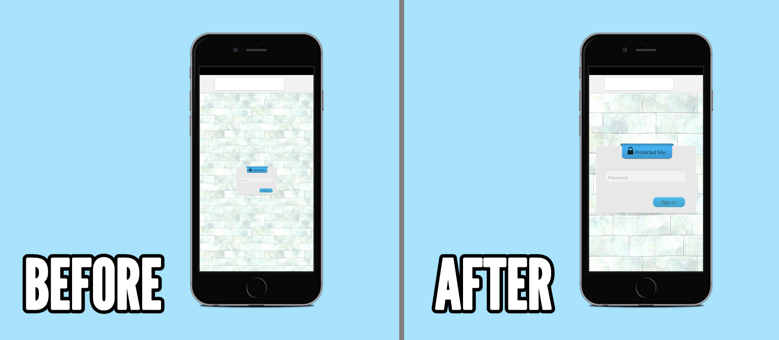
The End Result
Before we get started, here’s what we are working toward.
Step 1. Override the login page template file
For more information on how to override login pages, refer to the section titled “How to override the login page template within your theme folder” on http://www.clevelandwebdeve
Step 2. Edit the template file page
For the sake of example, let’s assume you are using the Ice theme for your login page. Open up hmsice.php (if you were using the Iris theme you would open up hmsiris.php, etc…). Before the opening <style> tag, add the following new line of code:
|
1 |
<meta name="viewport" content="width=device-width,initial-scale=1.0"> |
Step 3. Add mobile-friendly CSS
In the Hide My Site settings page > Custom CSS:
|
1 2 3 |
@media only screen and (max-width: 767px) { body {zoom:90%;} /*Side comment - a 90% zoom is a good starting point. Try that first and see how it looks on mobile - you can change this number to zoom out or zoom in more, depending on which theme you are using.*/ } |
Step 4. Admire your final product
Your new login form now looks great on all devices. Well done!
Thanks for taking the time to follow this tutorial. Hope you find it helpful. Please let me know if you have any questions or other feedback in the comments.
Related Posts
- Hide My Site Multipass
- Hide My Site Custom Login Page Examples #2
- Hide My Site Custom Login Page Examples
- Hide My Site Bypass URL
- Hide My Site Redirect
- Hide My Site
- New feature added to Multipass – Clear All Logs
- What’s new in Hide My Site version 2.1
- Will Hide My Site be Gutenberg compatible?
- How to add a hyperlink to your Hide My Site login page


